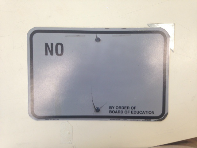
  Step 1: Step 2: When you first look at the photo, you'll initially notice big bold letters in the upper left corner that spell "NO". The picture is of a sign that initially had a very long message, but I used the clone tool on Photoshop to remove all the words except "NO". On the bottom right hand corner, I also left the words "BY ORDER OF BOARD OF EDUCATION". The sign is completely blank except for those two groups of words. I mounted on a metal sheet to make it look like an actual sign. The upper right hand corner of the photo has a cut-out metal triangle glued to the back of it as well.
Step 3: As far as elements of art go, I intentionally used space to make this piece more visually attracting. Usually when you think of a photo having "space", you think of 3D perspective. This photo, however, has lots of 2D space which forces you to look a certain place and gives the photo a more open feeling. The space lends itself perfectly to principle of design I intentionally used - a good focal point. With only two parts of the photo being black and the rest of the photo being white, your eye is immediately drawn to first the "NO" and then the "BY ORDER OF BOARD OF EDUCATION". To me, this makes you take appreciate what you read more, leaving a larger impact on the viewer. Step 4: I left the words I did to symbolize the freedom of speech that the school board limits sometimes without even thinking. They have a lot of control over what happens in the high school, and sometimes they seem so out of touch with what actually happens that they can't make the most educated decisions. The photo is meant to look as if the Board of Education just posted a sign that said NO, which exaggerates both the power and the decisiveness the Board of Education sometimes acts with. Step 5: I like the message of this photo a lot, and I like how it catches your eye and makes you think a little bit. Thats the goal of most of my photos, and I feel like this photo achieves that goal. I do think the quality of the mounting (especially the glued on metal triangle) could be improved, but I would definitely display this somewhere especially if I was able to put it somewhere where it actually looks like a real sign.
0 Comments
Leave a Reply. |
Harry SteinbergJust an average guy taking photos. Archives
December 2016
Categories |
 RSS Feed
